CLIENT: Mille Lire
CLIENT: Mille Lire
Location: Dallas, Texas
Year: 2017
Program: 4,120sf
For this Modern Italian concept, we wanted to bring in the modern essence of the cuisine and combine it with a refined design that gave a nod to the authenticity to a traditional italian restaurant on the canals of Venice. We looked to painted wood paneling material mixed with patterned textures, clean lines, modern fixtures combined to form a casual yet upscale space.
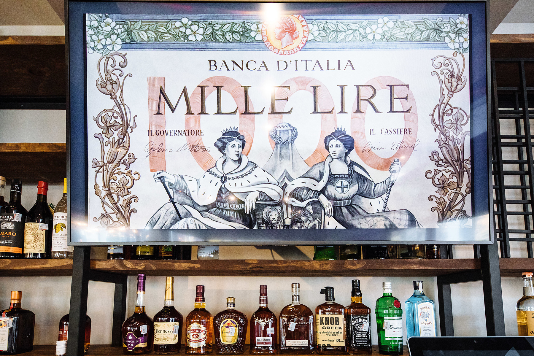
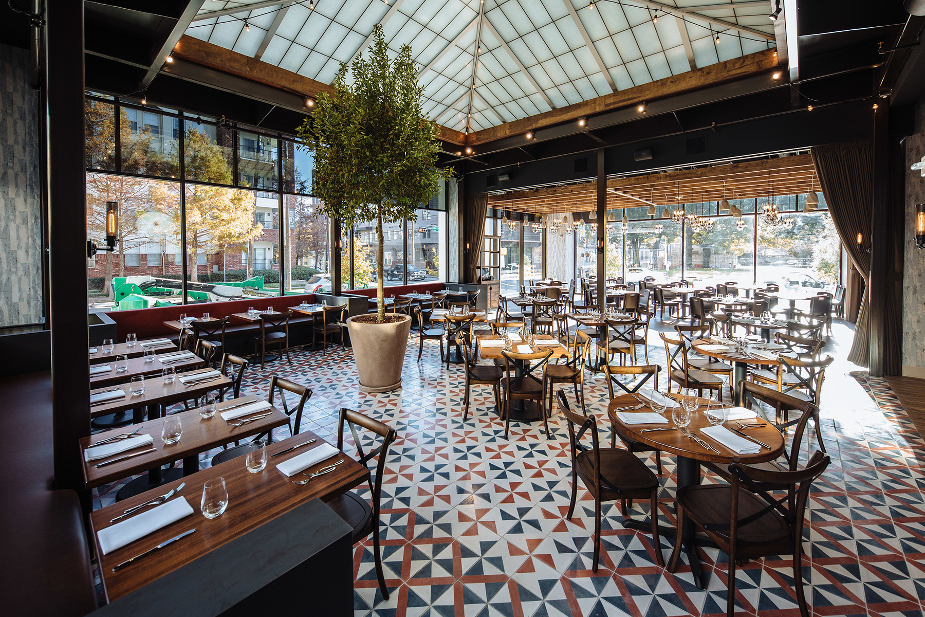
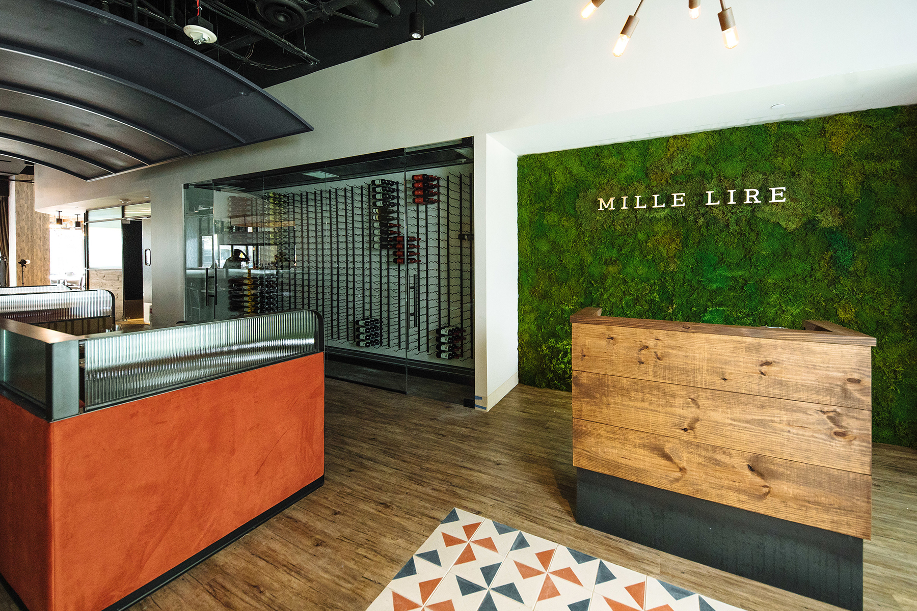
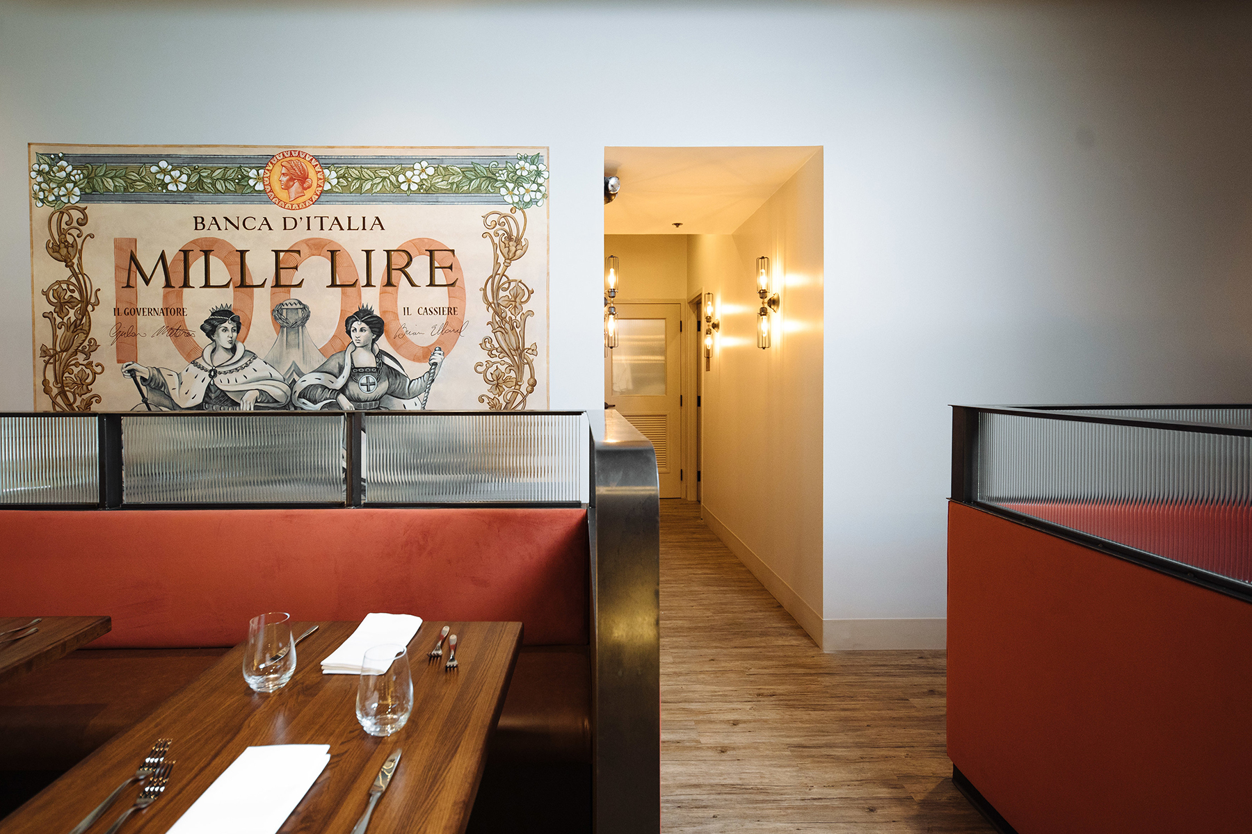
The main Mille lire entry greets you with a custom pattern tiled concrete tile rug and green wall host station backdrop. Central banquette seating lines the main corridor with a custom mille lire mural on one side and cold wine display on the other. Carefully detailed wood panelled and tufted banquettes are combined with dark metals and ribbed glass for a clean modern interpretation of italian restaurant seating. Geometry is broken up by a curved bar on one side and a curved interior storefront prep area on the other. A custom, in house designed bar pendant matches the footprint of the bar below for a sleek and modern bar height dining experience. The main dining space transitions into light filled atrium style open feel dining room complete with an Olive tree and a continuation of the entry patterned concrete tile. On the other side, a warmer, wood floored private dining room is complete with a custom solid wood stained trellis and filled with combination of metal and concrete light fixtures. The final space becomes a modern interpretation of an authentic Italian atmosphere finished in light and airy materials for a dining experience as unique as Chef Giuliano Matarese’s menu.
Branding
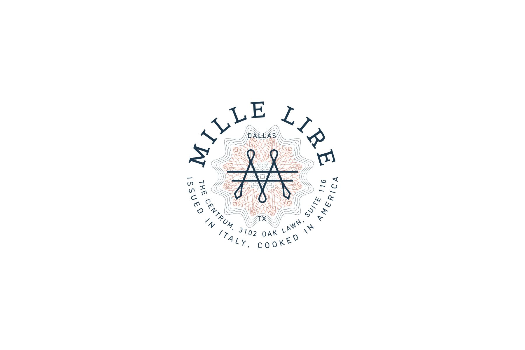
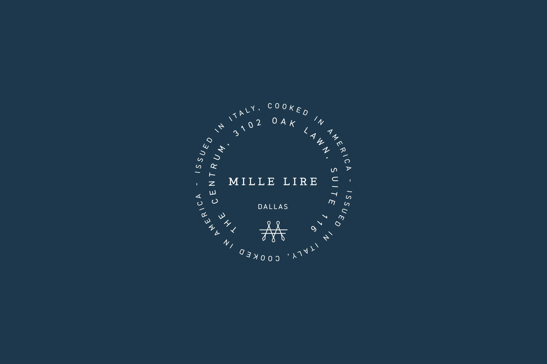
Using ‘La Banconota da Mille Lire’ as the starting point for the brand, we created a logo inspired by this antique currency that gave the restaurant it’s identity. We focused on the detail of the banknote and took cues from the typography, structure and their ornamental guilloche patterns. We wanted the brand to be an interpretation of the organic quality and dynamic detail of the banknote itself. We referenced the national color of Italy, Azzurro, and combined it with complementary tones for a modern feel. The hand drafted icon was inspired by the Italian lira symbol and was combined with two sans serif lettering circles that help bring the focus in on the serif mille lire logo typeface. Mixed with a custom guilloche pattern behind the Mille Lire brand is carefully crafted to bring together the vintage currency it is derived from with the forward, casual restaurant menu and design.