CLIENT: Picole Pops
CLIENT: Picole Pops
Location: Dallas, Texas
Year: 2017
Program: 2,160sf
In line with It’s Brazilian roots, our vision for this Paleteria was to bring in the naturally vibrant and playful Brazilian style. We looked to Rio De Janeiro multicolored Favelas for color and pattern inspiration and looked to the elements of natural forests and winding Favela roads for spatial cues.
A vibrant yellow subway tile counter housing Brazilian aguas frescas and palets lines one side of a long horizontal space. Wood structural ceilings above are left raw and exposed along with the concrete floors below and the walls are faced in a contrasting white horizontal linear tile. The ordering queue direction mimics the applied finishes guiding the customer up to the elevated casual seating area. Counter height wood top tables with matching seating lay the space out. Walls painted in similar colors to the main entry are mixed with similar white tile. A large window connects the exterior patio complete with a custom stained wood trellis and green wall..


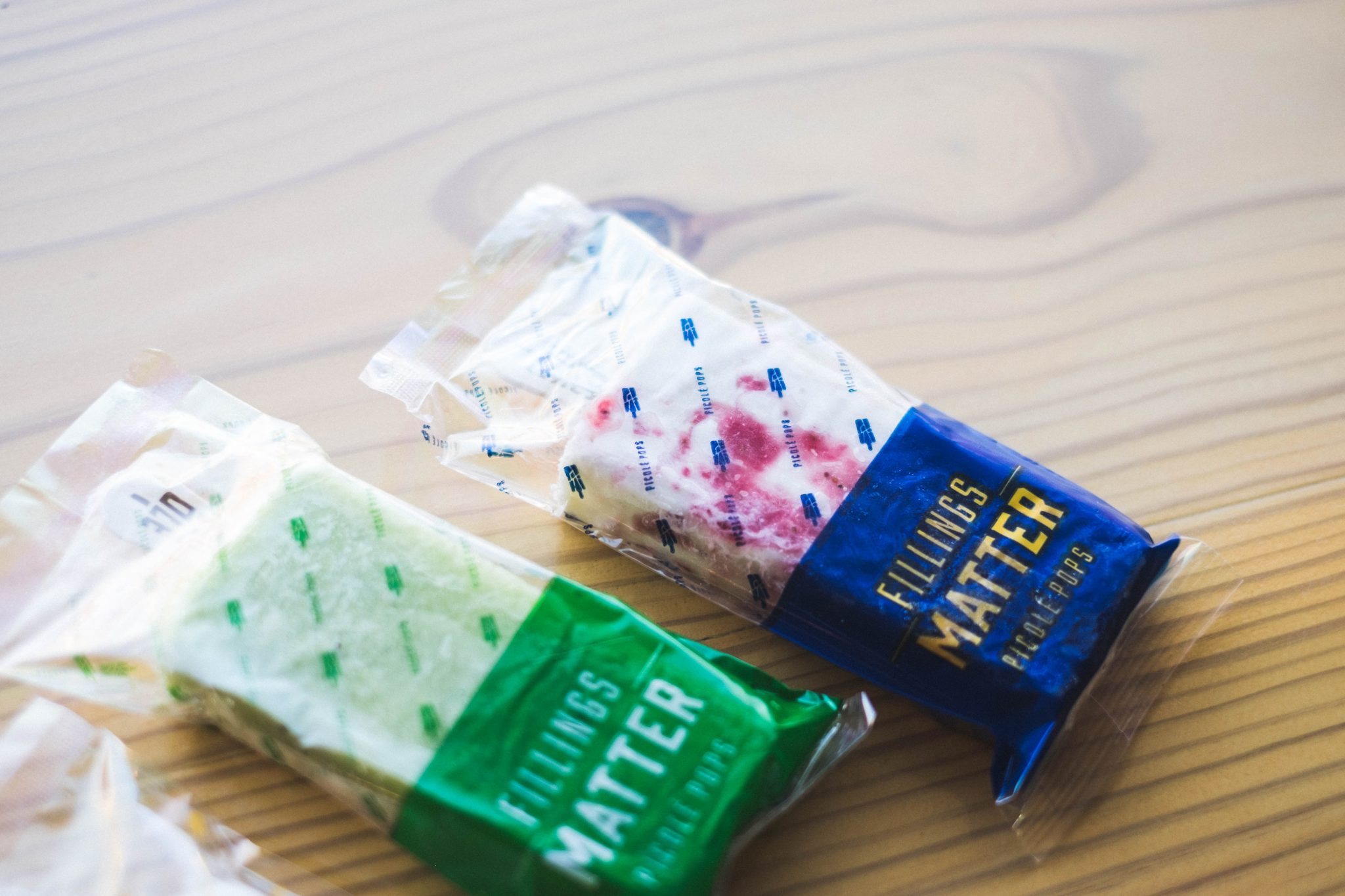
Branding
The Picole pops identity takes the iconic paleta silhouette with voided jagged and irregular ‘paths’ inspired by aerial views of Brazilian Favela roads and pathways and their recognizable Haas&Hahn Favela painting projects. The negative spaces created by the pathway voids reveal the word ‘Picole” in an similarly irregular way. Colorway inspiration came directly from these vibrant favela murals and is applied to the brand in the same way for an overall playful take on the iconic Brazilian stylistic art and infrastructure.